📌 Short details
- CTR formula: clicks ÷ impressions × 100. Find it in YouTube Studio under Analytics, then the Reach tab for one video or the Content tab for the channel.
- Honest benchmark: YouTube says half of all channels and videos have an impressions CTR between 2% and 10%. Compare a video with your own last 10 videos, not with another channel.
- Thumbnail text rule: 3–4 words maximum, large enough to read at 320 pixels wide on a phone.
- Title rule: aim for under about 60 characters so it is not cut off on mobile; put the most important words first.
- Pairing rule: title and thumbnail must add to each other. If the thumbnail repeats the title word for word, you have wasted one of your two hooks.
- Testing rule: change one thing at a time, and wait for enough impressions before judging — a result on a few hundred impressions is noise.
- No guarantee: better packaging improves your chances of earning a click and a watch. It never guarantees views, subscribers, or income.
- Cost of the method in this guide: $0, using YouTube Studio and free design tools.
📊 CTR fundamentals: what the number really means
CTR answers one question only: of the people who were shown your thumbnail, how many clicked it? YouTube counts an impression only when the thumbnail is shown for more than 1 second with at least 50% of it visible, so a fast scroll-past is not counted against you. That definition matters, because it means CTR is a packaging score — title plus thumbnail — not a quality score for the video itself.
Read CTR with three companions, every time: impressions, views, and average view duration (retention). Each pairing tells a different story:
| What you see | What it usually means | What to fix first |
|---|---|---|
| High impressions, low CTR | YouTube is showing the video, but viewers are not choosing it | Title + thumbnail — this guide |
| High CTR, low retention | The packaging promised more — or something different — than the video delivers | The promise: tighten the title, or fix the video's opening |
| Low impressions, steady CTR | Packaging is fine for the people who see it; the video is not being shown widely yet | Topic and search demand, not a new thumbnail |
| CTR jumps on one video only | One strong topic or one strong package, not a channel-wide change | Repeat that package on the next similar topic and compare |
Compare by traffic source, not just overall. Browse (home feed) impressions behave differently from search impressions, which behave differently again from suggested-video impressions. A thumbnail that wins in search, where the viewer already wants the topic, can lose in browse, where it competes visually with a dozen other thumbnails. In Studio, split CTR by traffic source before you declare a winner or a loser.
Do not judge early or small. Do not judge CTR in the first hours after upload, and do not judge it on a few hundred impressions. A video with 80 impressions and a 12% CTR has had about 10 clicks — one viewer's choice either way swings the percentage. Wait until a video has a meaningful run of impressions, compare it with your own recent average, and only then change the packaging.
Why retention is half the score. YouTube's own guidance describes a thumbnail as likely clickbait when it shows high CTR but low average view duration and lower-than-expected impressions afterwards. In plain terms: a misleading click borrows a view and repays it with a viewer who leaves early and is less likely to click you again. Honest packaging is not just good manners — it is the version that keeps earning impressions.
✍️ Title hooks: six formulas that stay honest
A title hook is not a trick. It is a clear promise, phrased so a stranger scrolling a feed understands in two seconds what they will get and why it matters to them. The title does the explaining; the thumbnail does the stopping. Write the title first, then design the thumbnail to add to it.
Keep three rules on every title, whatever formula you use: (1) the first words carry the topic and the benefit, because mobile cuts titles off; (2) the title must be true of the video — if the video does not deliver it, rewrite the title, not the viewer's expectation; (3) one promise per title — a title that promises three things promises nothing clearly.
| Hook formula | How it works | Honest example |
|---|---|---|
| Specific result | Name the outcome and the scope, with a number where it is real | 5 Free Tools That Fixed My Channel's Thumbnails |
| Open question | Ask the exact question the video answers | Why Do Some Thumbnails Get Clicked and Others Ignored? |
| Mistake warning | Name the mistake the viewer can avoid — only if the video names it too | 3 Thumbnail Mistakes That Cost New Channels Clicks |
| Contrast / before-after | Show the change, not just the topic | Before and After: Rebuilding One Thumbnail for More Clicks |
| “I tried” test | Report a real test you actually ran | I Tested 3 Thumbnails on One Video — Here's What Changed |
| How-to with a limit | Promise a method, bounded so it stays believable | How to Design a Readable Thumbnail in 15 Minutes |
Words to use with care. Superlatives (“best”, “ultimate”, “secret”) only earn trust when the video backs them up — a “secret” that is common knowledge, or a “best” list with no test behind it, teaches viewers to skip your next title. All-caps words, strings of exclamation marks, and vague shock words (“shocking”, “insane”, “you won't believe”) are the fastest way to look like every low-trust thumbnail in the feed. A specific, calm title from a channel viewers trust beats a loud title from a channel they have learned to ignore.
Search still matters. If viewers search for the topic, include the plain words they would type — “YouTube thumbnail”, “CTR”, “title hooks” — near the front of the title. A clever title nobody can find in search, and a searchable title nobody wants to click, are two different failures. The formulas above are built to do both: the searchable topic first, the hook second.
🎨 Thumbnail design rules: built for a phone feed
Most viewers meet your thumbnail on a phone, at roughly 320 pixels wide, scrolling fast. Design for that moment, not for how the image looks full-screen on your computer. If it does not work small, it does not work.
Size and format. Upload a 16:9 image — 1280 × 720 pixels is the long-standing minimum, and YouTube now recommends up to 3840 × 2160 pixels. Use JPG or PNG. Keep the file within YouTube's limit (2 MB on mobile upload, larger on desktop) and keep every important element inside the inner safe area, away from the edges and the bottom-right corner where the video duration stamp sits.
The 3-element rule. A strong thumbnail usually has at most three things competing for attention: (1) one subject — a face with a clear emotion, or one clear object or result; (2) one context element — a prop, a comparison, or a background that signals the topic; (3) 3–4 words of text, in a bold, high-contrast font. A fourth element rarely adds information at feed size; it adds noise. One subject, large in the frame, beats three small subjects every time.
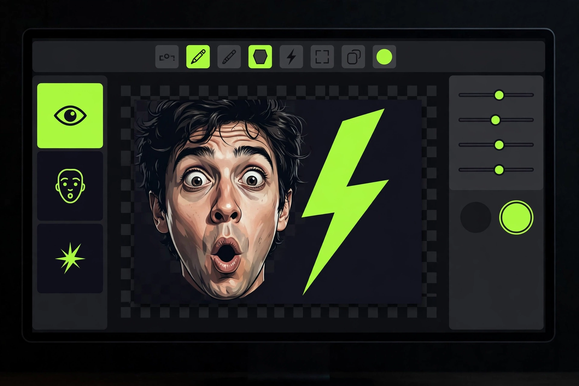
Faces, and what to do without one. Faces draw the eye fast, and a clear emotion — surprise, curiosity, satisfaction — communicates the stakes before a word is read. Keep eyes in the upper part of the image, do not crop a face mid-feature, and make sure the emotion matches the video: a shocked face on a calm explainer is a mismatch viewers remember. Faceless channels are covered separately below — an object, a result, or a before/after split can carry the same job.
Contrast and colour. Your thumbnail competes against YouTube's own neutral interface and against every other thumbnail in the feed. A subject that blends into its background disappears at small size, however good it looks large. Use high contrast between subject and background, one dominant colour family, and text with a strong outline or shadow so it survives shrinking. Bright is not the same as readable — test readability, not brightness.
The 320-pixel test (free, 30 seconds). Shrink your finished thumbnail to 320 × 180 pixels, or hold your phone at arm's length, and answer three questions: Can I read the text? Can I recognise the subject? Can I tell what the video is about? If any answer is no, the thumbnail is not finished, however polished it looks at full size. Run this test before every upload, and again whenever you change a thumbnail on an older video.
Free tools only. You do not need paid design software to follow these rules. A free design tool such as Canva's free tier is enough for text, contrast, and layout at 1280 × 720, and YouTube Studio itself handles upload and testing. Spend your effort on the idea and the readability test, not on a subscription.
✅ The thumbnail checklist
Run every thumbnail through this checklist before upload. A “no” in any row is a fix, not a reason to publish and hope.
| Check | Pass looks like | If it fails, fix this |
|---|---|---|
| One subject | One face, object, or result fills most of the frame | Remove the second and third subjects; enlarge the first |
| Text: 3–4 words max | Words are large, bold, and add to the title | Cut words until only the stakes remain; never repeat the title |
| Readable at 320 px wide | Text, subject, and topic are clear at phone-feed size | Increase text size and contrast; simplify the background |
| High contrast | Subject stands out from background and from YouTube's interface | Darken or lighten the background; add outline or shadow to text |
| Emotion matches video | The face or result shows the video's real feeling | Re-shoot or re-pick the expression; a mismatched face is a broken promise |
| Honest about content | Everything shown appears in, or is fairly shown by, the video | Remove anything the video does not deliver — see clickbait mistakes below |
| Safe area clear | No key text or face under the duration stamp or edges | Move text and faces inward, away from corners |
| One style, recognisable | Viewers can spot your videos in a feed over time | Keep font, colours, and layout consistent; change one variable per test |
🧩 Pairing title + thumbnail: layer, don't duplicate
Title and thumbnail are two hooks for one click, not two copies of the same hook. Together they should say more than either says alone. The usual split is: the title makes the promise or asks the question, and the thumbnail shows the stakes, the proof, or the visual question. When both say the same words, one of them is wasted.
Try this pairing test before upload. Cover the title and read only the thumbnail: what do you learn? Then cover the thumbnail and read only the title: what do you learn? If the second answer adds nothing to the first, rewrite one of them. Good pairs feel like this:
- Title promises, thumbnail proves: title “How to Design a Readable Thumbnail in 15 Minutes” + thumbnail showing a blurred thumbnail sharpened into a clear one, with the words “Before → After”.
- Title asks, thumbnail teases: title “Why Do Some Thumbnails Get Clicked and Others Ignored?” + thumbnail with two thumbnails side by side, one circled, and the words “Spot the Difference”.
- Title names, thumbnail reacts: title “3 Thumbnail Mistakes That Cost New Channels Clicks” + a face reacting to a cluttered thumbnail, with the words “Too Much Text”.
Keep the same pairing logic when you test. If you change the thumbnail, keep the title fixed, and vice versa — otherwise you will never know which change moved CTR. And keep the video's opening matched to the pair: the first 10 seconds should deliver, or clearly start delivering, exactly what the title and thumbnail promised. A strong pair with a slow opening still loses the viewer.
🔄 Before / after title examples
Each pair below keeps the same video and the same honest content. Only the packaging changes — and that is the point. Notice how every “after” is more specific, shorter, or both, and none of them promises something the video does not contain.
| Before (weak) | After (stronger) | Why the after wins |
|---|---|---|
| My YouTube Video About Thumbnails | 5 Thumbnail Rules That Survive a Phone Feed | Specific, countable, and names the viewer's real problem |
| How To Get More Views On YouTube!!! | Why Your Thumbnail Loses the Click (And the Fix) | One diagnosis, one promise — no shouting, no vague “views” |
| Thumbnails, Titles, CTR, Algorithm, Growth Tips | Title + Thumbnail: The Pair That Earns the Click | One idea instead of a keyword pile; the pairing is the lesson |
| You Won't Believe What This Thumbnail Did!! | I Changed One Thumbnail — CTR Moved. Here's Why | Reports a real test instead of teasing an unnamed shock |
| Best YouTube Tips Ever For Beginners 2026 | Beginner's Thumbnail Checklist: 8 Checks Before Upload | Searchable, usable, and deliverable — the video can be the checklist |
| Watch This If You Want To Grow On YouTube | 3 Words or Fewer: Writing Thumbnail Text That Reads | A concrete rule the viewer can use in the next 10 minutes |
Use the same method on your own titles. Write the vague version first if you must, then ask: what is the one specific thing this video teaches, and can a stranger understand it in two seconds? Cut every word that does not help answer that question, front-load the topic, and stop when the title fits on a phone without being cut off mid-promise.
🧪 Testing honestly: one change, enough impressions
Guessing which thumbnail works is slower than testing it, and testing badly is worse than not testing at all. YouTube Studio's free Test & Compare feature (where available on your channel) lets you test up to three thumbnails on one video and picks a winner on watch-time-weighted performance — not raw clicks alone, so a thumbnail that earns clicks viewers abandon does not win by cheating. If the feature is not yet available on your channel, you can still test honestly by swapping a thumbnail and comparing the same traffic source over a comparable period.
- Prepare 2–3 genuinely different options before upload. Different subject, different text, or different layout — not three shades of the same idea.
- Change one variable at a time. If you change the face, the text, and the title together, a CTR move tells you nothing about what caused it.
- Let the test run. Give it enough impressions to mean something — thousands, not hundreds — and roughly two weeks where the feature runs that long. Do not stop a test because the first day looks good or bad.
- Read CTR with retention. A winning thumbnail that drops retention is not a win. Pick the option that earns clicks and keeps viewers watching.
- Keep a one-line note per test. “Face + 3 words beat object + 5 words on browse, CTR 3.1% → 4.4%, retention steady.” Without notes, you will re-run the same test next month.
Old videos can be fixed too. You can replace a thumbnail and edit a title on an older video at any time in Studio, and a packaging fix on a back-catalogue video with strong watch time but weak CTR is often the cheapest improvement available — the video already proves viewers stay, it just needs a better invitation. Start with your best-retention, lowest-CTR videos, not your newest ones.
⚠️ Clickbait mistakes to avoid
Clickbait is not “a thumbnail that works”. Clickbait is packaging that earns a click by promising something the video does not deliver. The difference is the promise, and viewers — and YouTube's systems — learn the difference fast. These are the mistakes that cost more than they earn:
| Mistake | Why it backfires | Honest alternative |
|---|---|---|
| Shocked face + object never in the video | Viewer feels tricked, leaves early, skips your next video | Show the video's real subject or result |
| Title promises a result the video never shows | High CTR, collapsed retention, fewer future impressions | Promise only the result the video actually demonstrates |
| Fake numbers, fake quotes, fake “proof” | Breaks trust and can breach YouTube's misleading-content policies | Use only numbers and claims you can show or source |
| Arrows and circles pointing at nothing | Trains viewers to ignore your signals, including real ones | Point only at something the video genuinely reveals |
| Repeating the title word for word on the thumbnail | Wastes the second hook; adds no curiosity or proof | Let the thumbnail add stakes, proof, or a visual question |
| Clutter: 5 fonts, 4 colours, 3 subjects, 10 words | Unreadable at phone size, so the click goes to a clearer rival | One subject, one colour family, 3–4 words (see checklist) |
Curiosity gap vs clickbait — the honest line. A curiosity gap withholds how something works until the viewer watches; clickbait withholds whether the promised thing exists at all, or implies something false. “I Changed One Thumbnail — CTR Moved. Here's Why” is a gap: the video shows the change and the result. “You Won't Believe What This Thumbnail Did” with no real result inside is bait. If you would feel misled clicking your own thumbnail after watching the video, rewrite it before anyone else has to.
Also respect YouTube's own rules on thumbnails and titles: no misleading imagery, no sexual or shocking imagery used only to attract clicks, and no impersonation. A channel that repeatedly misleads viewers risks strikes and reduced distribution, not just one weak video. Honest packaging is the only packaging that compounds.
🎭 Faceless channels: clicks without a face
Faceless channels cannot lean on a reaction face, so they need a different visual anchor — and they have good ones. The job is the same (stop the scroll, promise one thing, prove it fast), but the subject changes:
- Show the result, not a person. A finished product, a clear before/after split, a map, a chart moving, or the object the video is about, large in the frame.
- Use one bold visual contrast. Before vs after, right vs wrong, small vs huge — a split screen or a single arrow between two states reads instantly without a face.
- Let the text carry the emotion. Where a face would show surprise or relief, 3–4 honest words can carry it: “Fixed in 15 Minutes”, “Before → After”, “The Mistake”. Keep the words true to the video.
- Keep a consistent visual style. Faceless channels are recognised by layout, colours, and subject type, not by a presenter. Consistency is what makes your next thumbnail recognisable in a feed.
- Do not fake a face. Stock faces, AI faces, or another creator's face used to imply a presenter you do not have will mislead viewers and can breach impersonation and synthetic-content rules. If your channel has no presenter, its thumbnails should not pretend otherwise.
The same checklist, pairing test, and 320-pixel test apply unchanged. A faceless thumbnail that passes them will beat a face thumbnail that fails them — readability and honesty outrank any single ingredient.
🗓️ A simple weekly packaging workflow
Packaging improves fastest when it is a habit, not a rescue mission after a weak upload. Try this rhythm for your next four videos:
- Before recording: write the title first, in one specific promise. If you cannot write it, the video's idea is not clear enough yet.
- Before designing: decide the thumbnail's one subject and its 3–4 words, using the pairing test — what does the thumbnail add that the title does not?
- Before uploading: run the checklist and the 320-pixel test. Fix every “no” before publish, not after.
- After publishing: do not judge CTR for the first days. Note the video's CTR by traffic source once it has meaningful impressions, alongside retention.
- Each week: spend 15 minutes in Studio comparing your last few videos. Keep the package that earned clicks and retention; retire the one that earned clicks alone.
After four videos you will have something more valuable than one viral thumbnail: a repeatable style, a note of what worked on your channel, and a habit of testing one variable at a time. That is how CTR improves steadily — by testing, not by guessing louder each week.
💰 What help costs: DIY vs agency
Everything in this guide costs $0 to do yourself: YouTube Studio, free design tools, and your own testing notes. What costs money is having someone else do the production properly — original scripts, voiceover, editing, thumbnails, and review — at a pace you can hold. That is the honest difference between DIY and an agency: not magic, but hours and consistency.
| Path | What you get | ScaleTrio price | Best for |
|---|---|---|---|
| DIY packaging | This guide's method, done by you, with free tools | $0 | Beginners with time to test and learn |
| Starter | 5 videos, full done-for-you production | $299 | Testing one format properly |
| Growth | 15 videos, full done-for-you production | $799 | Building the habit and the data |
| Authority | 35 videos, full done-for-you production | $1,799 | A full push past the 33-video fair test |
Every package starts the same way: a free first stage — full channel setup plus a promo trailer — and you pay only after you have seen and approved that work. After approval, payment is staged: 50% to start production, 25% when half the work is delivered, and the final 25% when the full work is delivered. No income, view, subscriber, or monetization outcome is guaranteed at any price, and a 5- or 15-video batch on its own does not reach the volume a full channel test requires.
❓ Frequently asked questions
Tap a question to see the answer.
YouTube says half of all channels and videos have an impressions CTR between 2% and 10%, but there is no single good number for a beginner. Compare each video with your own last 10 videos and by traffic source, and read CTR together with retention — a click that leaves early is not a success.
Three to four words maximum, in a large, bold, high-contrast font that stays readable at 320 pixels wide on a phone. More words become unreadable at feed size, however good they look full-screen.
No. Title and thumbnail should layer, not duplicate: the title makes the promise or asks the question, and the thumbnail adds the stakes, the proof, or a visual question. Repeating the title wastes one of your two hooks.
Use YouTube Studio's free Test and Compare feature where available on your channel: it tests up to three thumbnails and picks a winner on watch-time-weighted performance. Change one variable at a time, let the test gather thousands of impressions, and judge the winner on CTR plus retention.
No. A misleading thumbnail may raise CTR briefly, but viewers leave early, trust drops, and YouTube's systems treat high CTR with low retention as a bad experience, which can reduce future impressions. Honest curiosity — withholding how something works, not whether it exists — earns clicks that keep watching.
Yes. Show the result, a before-and-after split, or one clear object large in the frame, with 3 to 4 honest words and a consistent style. Do not fake a presenter with a stock or borrowed face — a readable, honest faceless thumbnail beats a misleading face thumbnail.
🚀 Ready to see real work before paying?
No upfront payment to start. ScaleTrio builds your free first stage first — a full channel setup plus a promo trailer — and you pay only after you have seen and approved the work. See the full service, what's included, and the published packages on our YouTube automation services page, or start your free setup now at scaletrio.com/start.